![]()
From Burberry to Celine, it seems that every fashion house is eager to usher in a new era with an updated logo. And the last brand to follow this strategy is Balmain and it does so for the first time in 70 years.
For this restyling, creative director Olivier Rousteing turned to the design studio Adulte Adulte who completely abandoned the traditional extravagance of the previous logo, opting for a more recent and minimalist design.
![]()
Rousteing explained that “the purpose was to have a logo that everyone could remember”. And of course if they remember it, I’ll add that since it’s the same of the Laura Biagiotti one…
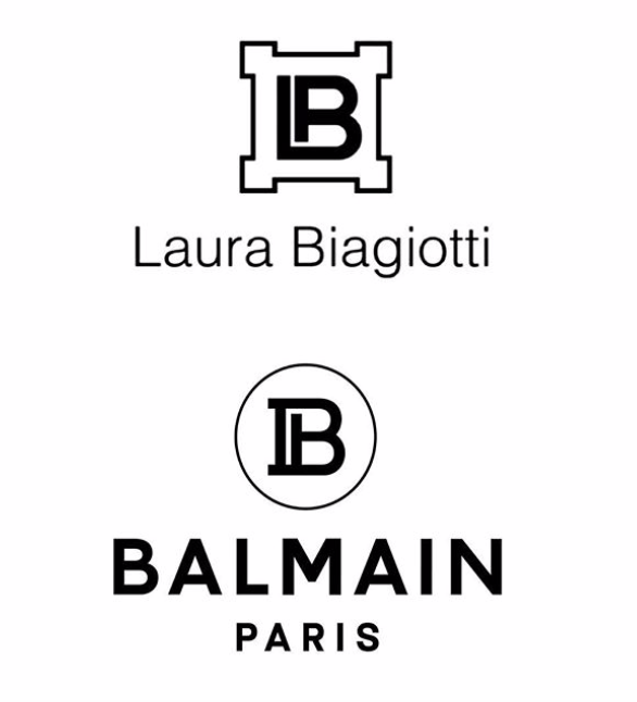
Even if a change of logo nowadays is not as shocking as it once was, the gesture still has a huge weight compared to the message it sends to both consumers and the fashion community in general. Above all in such an ambiguous situation.
Well come on, let’s say that the 70 years of waiting have been worth it aren’t they?
More from fashion

Loro Piana accused of not paying its indigenous workers in Peru
"Our excellence": this is the value proposition found on Loro Piana's official website under the "viçuna" section. And indeed, how could …

Meet the brand: Halíte – make it salty!
Essential, but precious. Casual, but well-groomed. Simple, but refined. The multifaceted soul of HALÍTE embodies all these aspects, just like …

Dialogue between art and fashion – the Renaissance of Ferragamo
Very profound creative paths and exchanges intertwine between art and fashion. Two worlds constantly evolution and contamination that have always …

